top of page
Now and then, a design makes you pause for just a moment before you nod.
I work for the nod.

01
CROWN VET | IDENTITY DESIGN | 2015
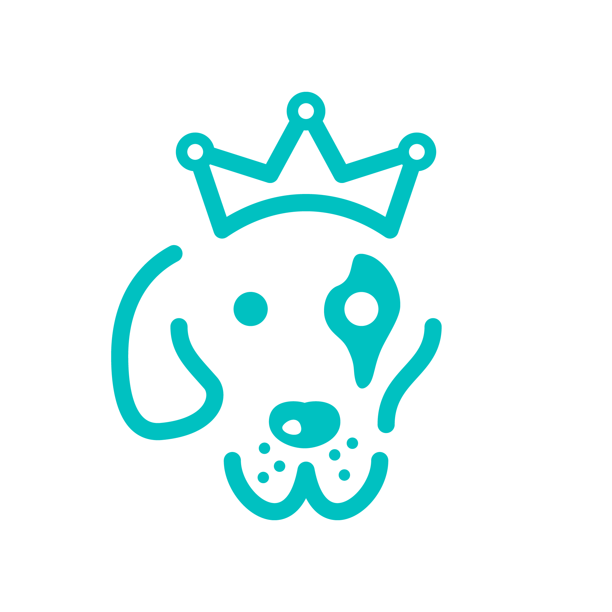
Pratapsinh Gaekwad comes from the royal house of Baroda. When he founded one of India's first premium veterinary care chains, the name Crown carried bloodline. The identity was built around something more personal — Chevy, his Great Dane, whose black fur patch over one eye was the single most distinctive thing about him. That patch and crown together became the face of the brand.
Aqua and deep red. Museo Slab. Stark, warm, and built to last.
Today Crown Vet has clinics across six cities and a partnership with Mars Veterinary Health. The logo was there from the beginning.

02
JEWELS BY QUEENIE | LOGO DESIGN | 2005
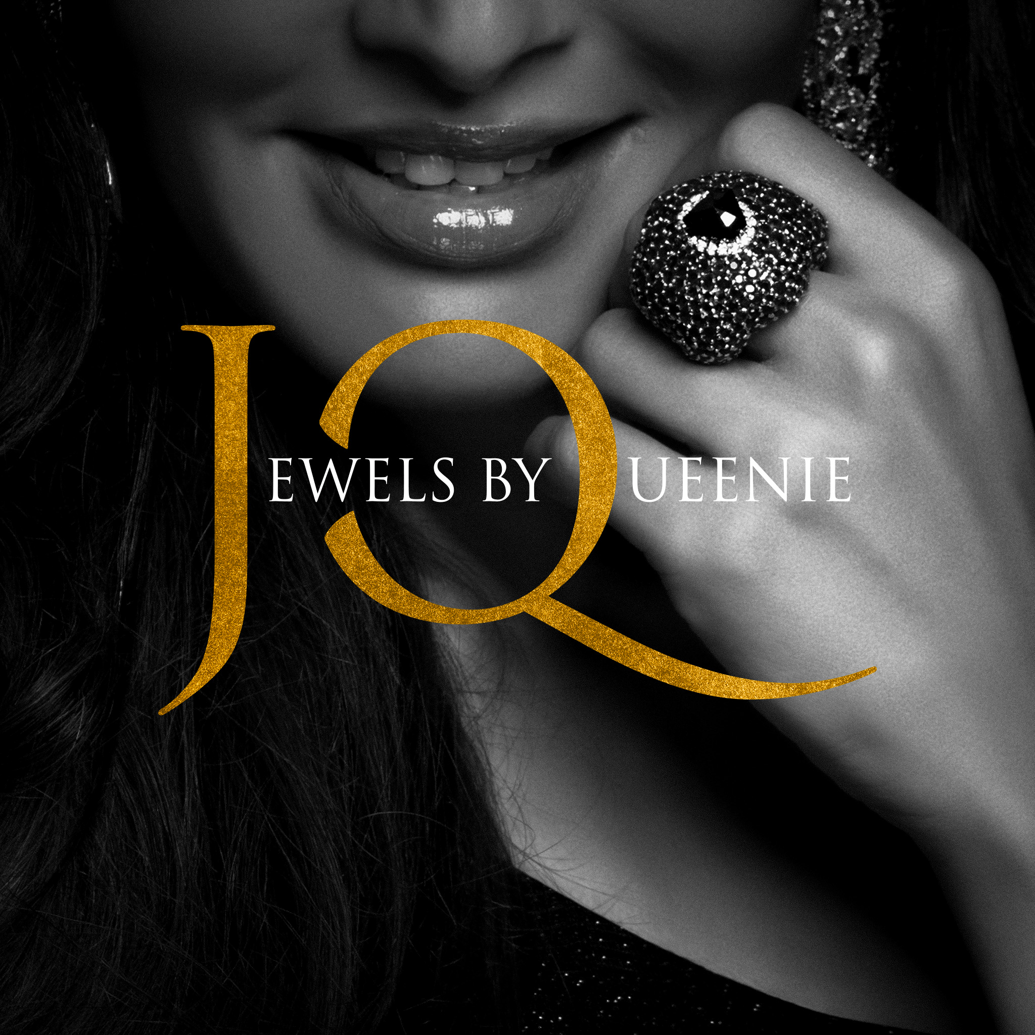
Queenie Singh — former Miss India, jewellery designer, and one of Mumbai's most recognisable faces — launched her label in 2003 and grew it into a name worn from Bandra to Beverly Hills. A logo for a woman who needed no introduction. Trajan's long-tailed ‘Q’ understood the assignment.

03
SPANEOS | IT COMPANY BRANDING | 2014
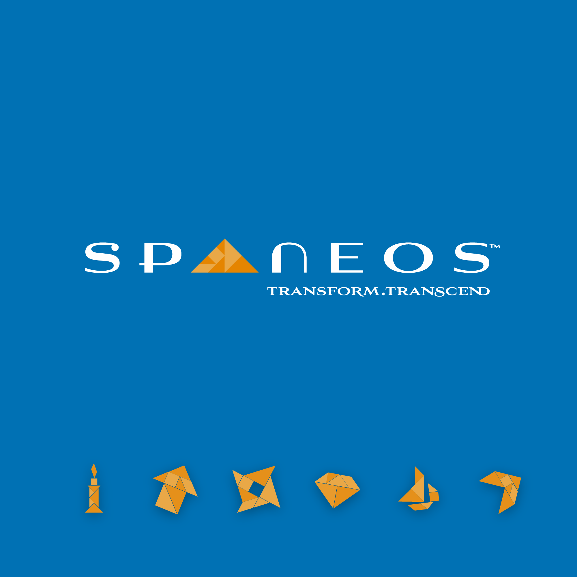
Seven senior professionals who had each led software majors came together to build something new. Their brief was one word — transformation. The tangram, a puzzle of seven pieces that shifts and reforms into endless configurations, became the identity — seven founders, seven pieces, one idea.

04
BOOK COVER DESIGN | RISHAD MEHTA | 2015
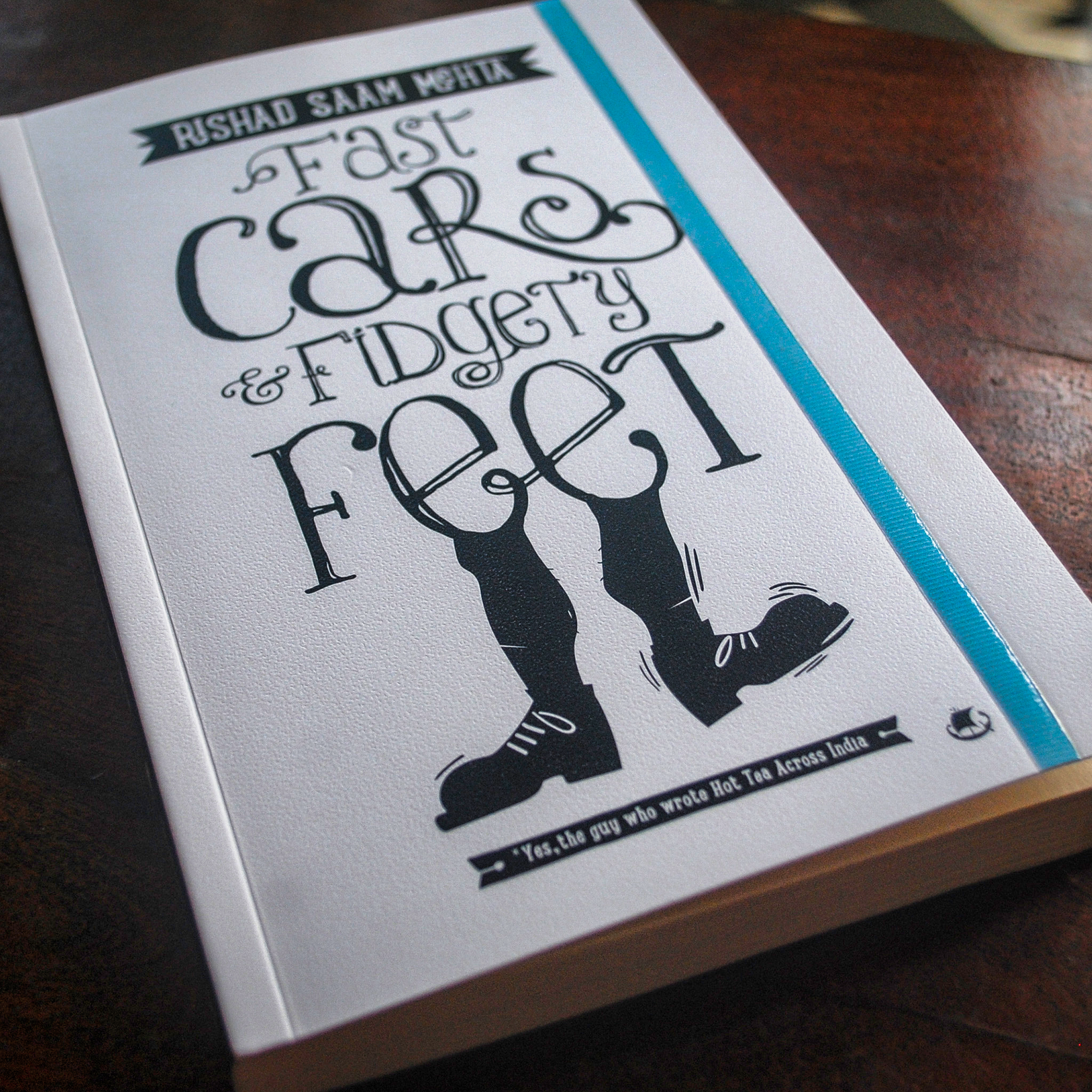
Fast Cars and Fidgety Feet. Road- and walk-trips across the world, in extraordinary cars, written by a man who became a travel writer because a job ad was wrapped around his lunch one day. Cover design and section typography.

05
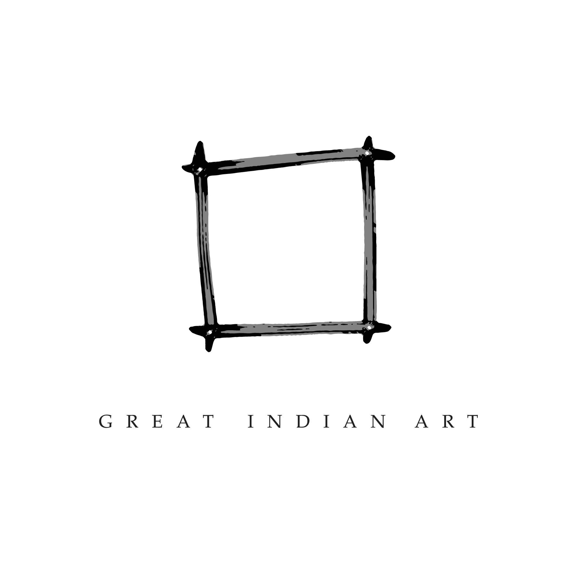
ART COLLECTOR LOGO | A. NAGAR | 2004
The barest logo for an art curator who championed Indian and African art before the world caught up. A rough, unfinished wooden frame — humble by design. Nagar was only ever the custodian. The art was always passing through.

06
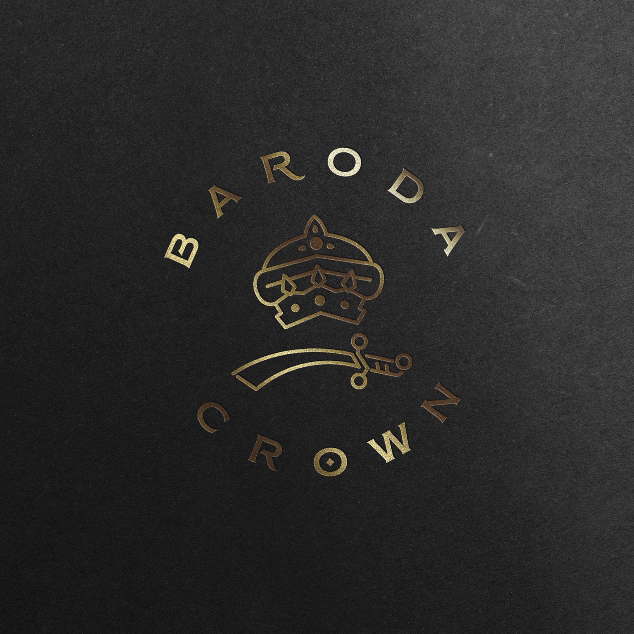
ROYAL CREST | GAEKWADS OF BARODA | 2012
A 17th century crest — illustrated turban, sword, full colour — reduced to its absolute essence. Pratapsinh Gaekwad wanted something that carried the weight of dynasty without the costume. Long and hard work, quietly worn.

07
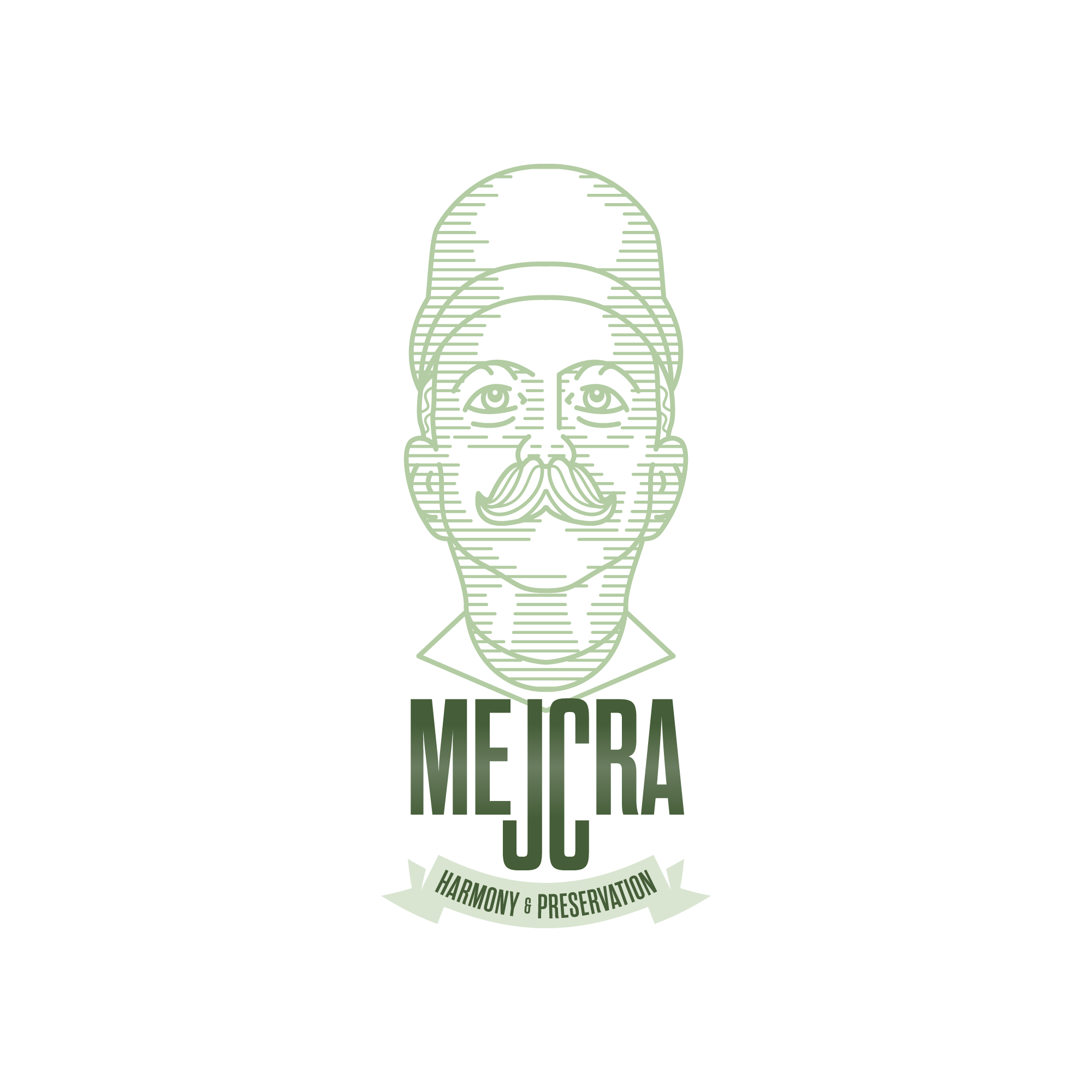
MEJCRA FOUNDATION | COMMUNITY | 2020
Mancherji Joshi envisioned and carved out a Parsi colony out of a marsh land. What stands in Dadar today — green, ordered, quietly magnificent — began with that one man who dared. This crest was made for the foundation that still carries his name and his work forward.

08
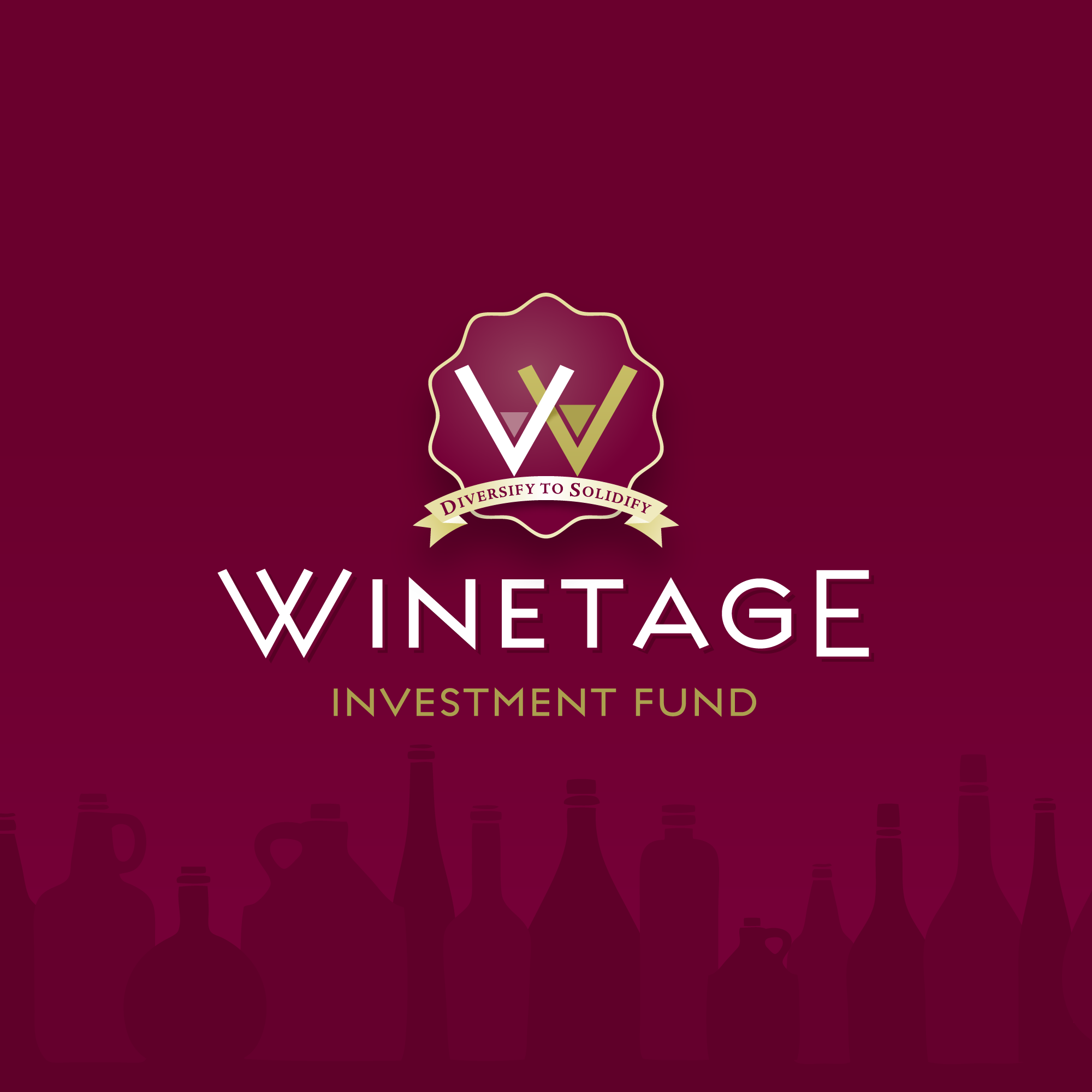
WINETAGE | LOGO | 2010
A Parisian Wine Investment Fund. Two chalices form a W. The wine level rises — steadily, deliberately, suggesting increasing returns. A crest for a fund that did exactly what it promised.

09
PERSONAL LOGO | TRAVEL WRITER | 2010
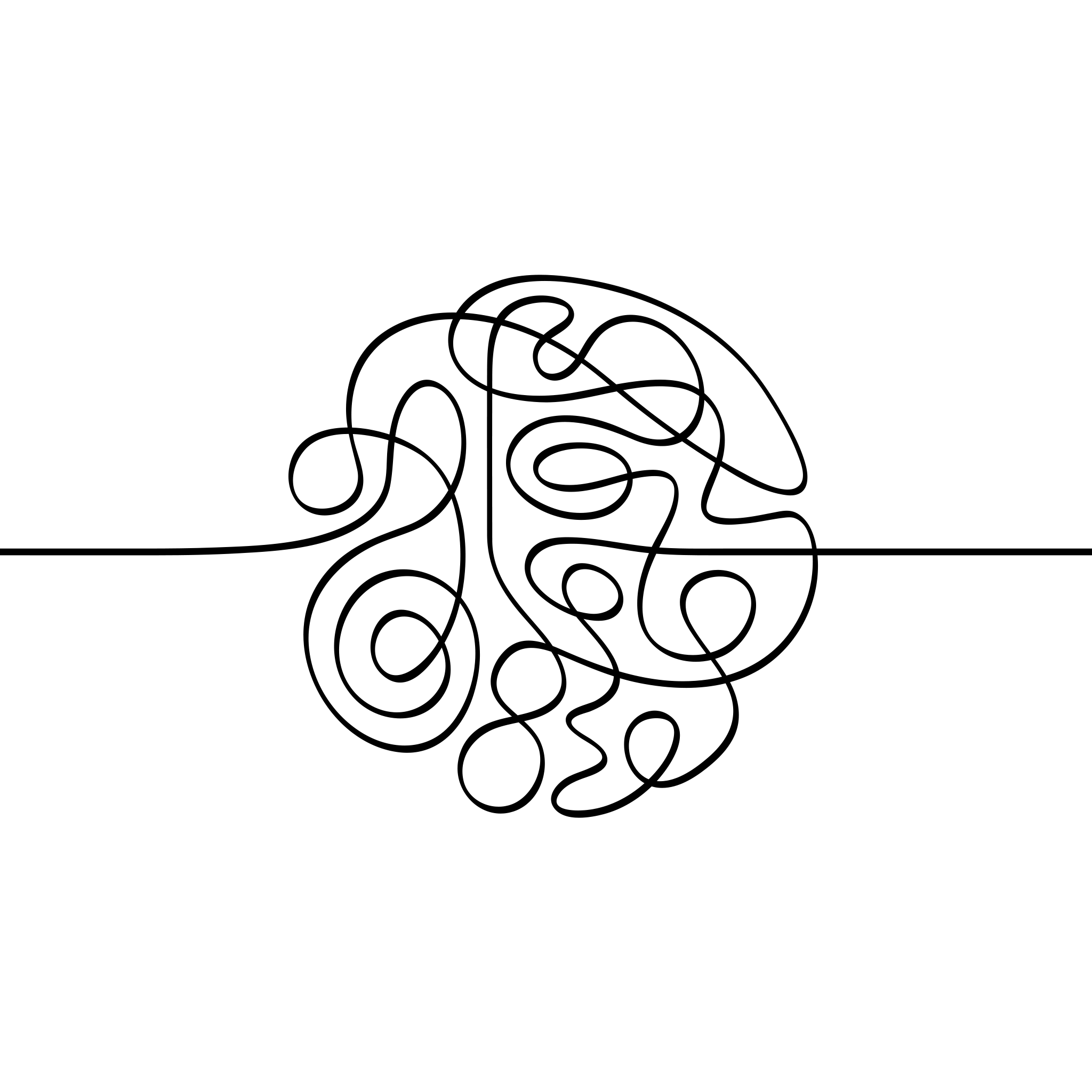
Rishad Mehta is a travel writer who arrives somewhere and doesn't leave until he's wrung it dry. One unbroken line — it knots and loops and coils into a city's worth of experience, then continues outward. The journey never stops.

10
AVA MARINE | YACHT DEALER | 2011
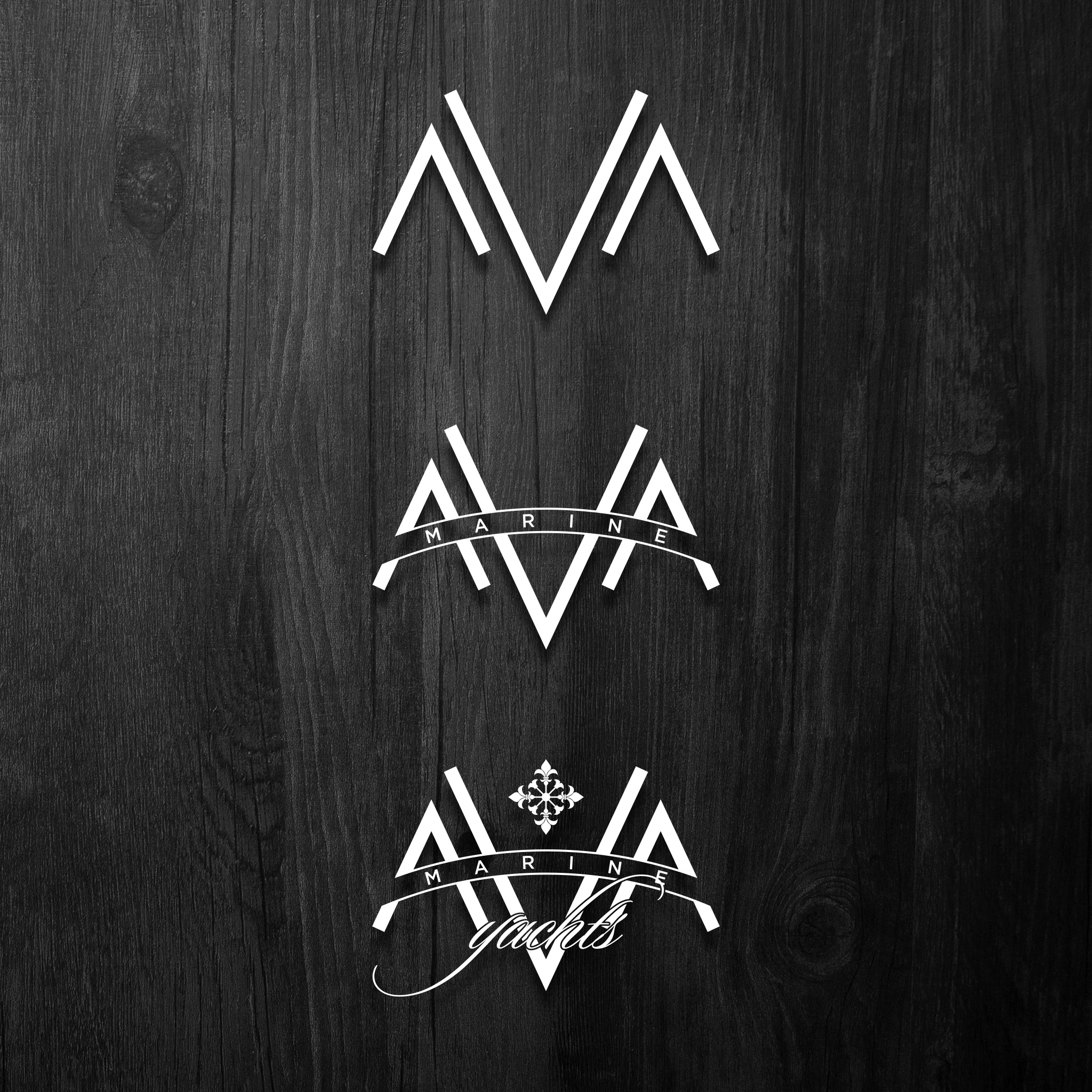
A Mumbai company that has lived on the water since 1989 — selling, managing and maintaining yachts for India's private sailing community. The logo needed to carry that quiet authority. Sea-level confidence. Nothing to prove.

11
NOUX | HEALTH-TECH PROVIDERS | 2020
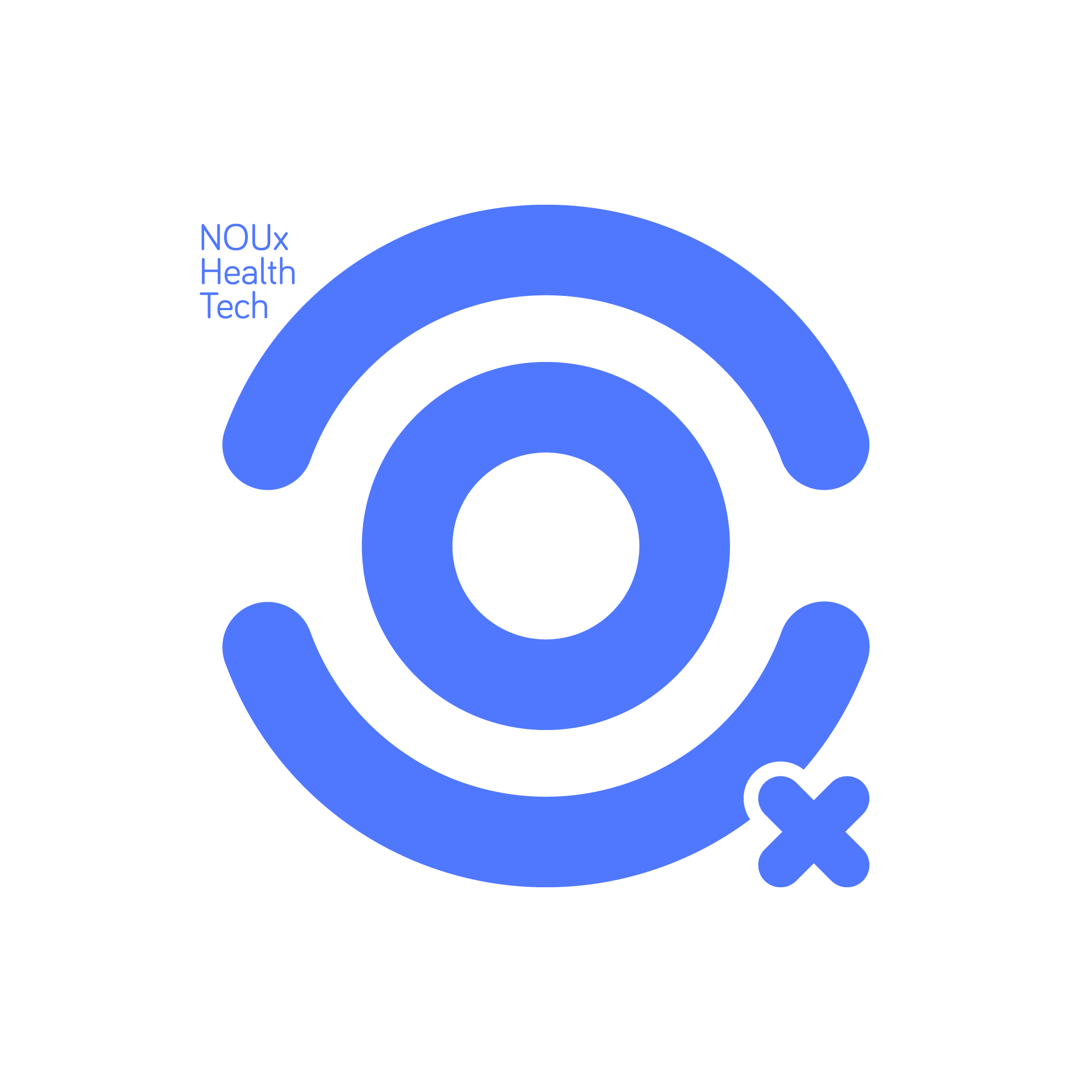
One of my favourite pieces, it is the N-O-U-X that spells out the logo — look again, you'll nod. The whole is an eye and the little "x" subscript is reminiscent of the Rx of healthcare.

12
NEW SCHOOL | UNIVERSITY SOFTWARE | 2010
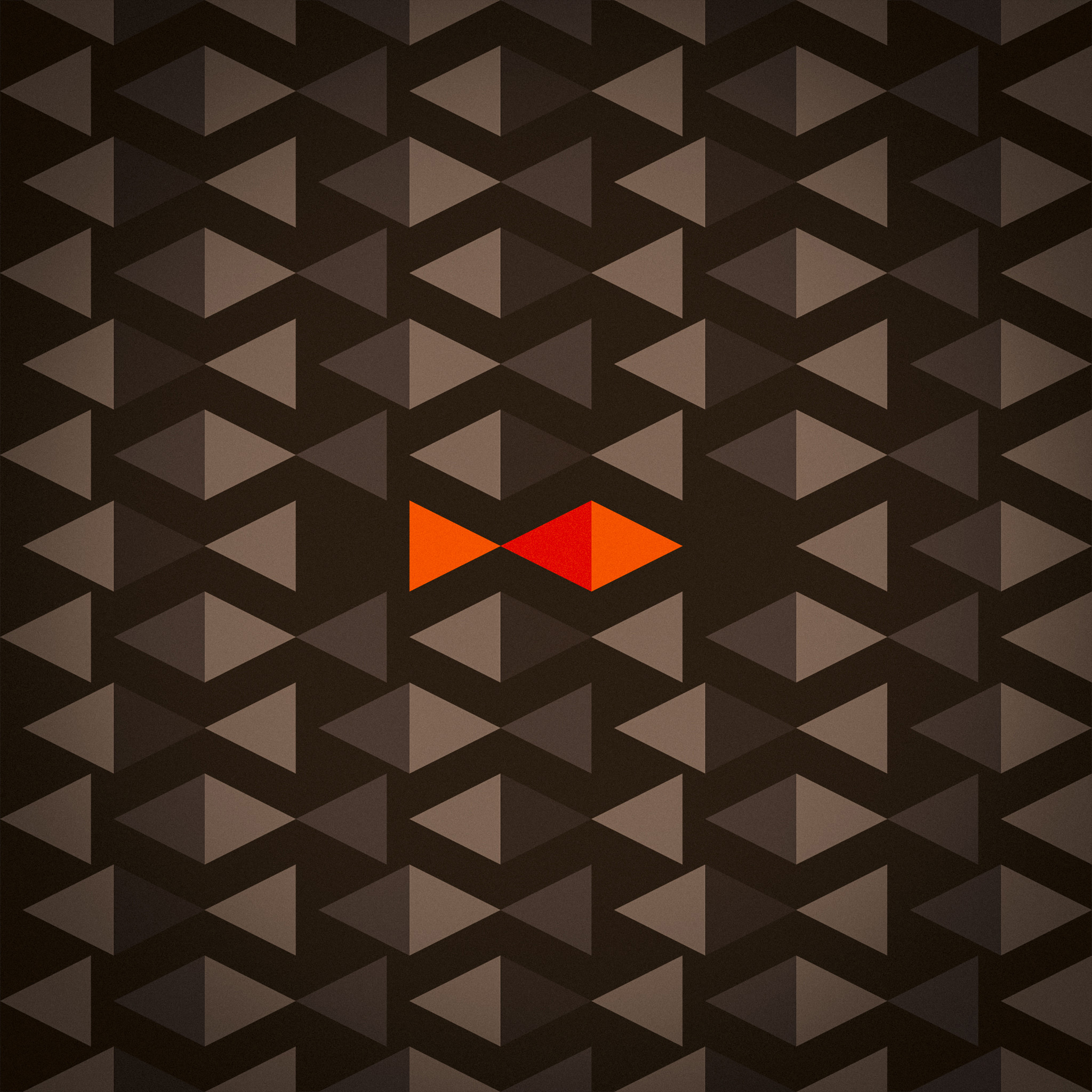
Patrick Malley wanted a logo that said his company did things differently. New School builds software for universities — and the name itself was the brief. A school of fish, all swimming one way. One going the other. That lone fish is the idea — the uncharted path, the unconventional thinker, the new school. Three readings, one mark.

13
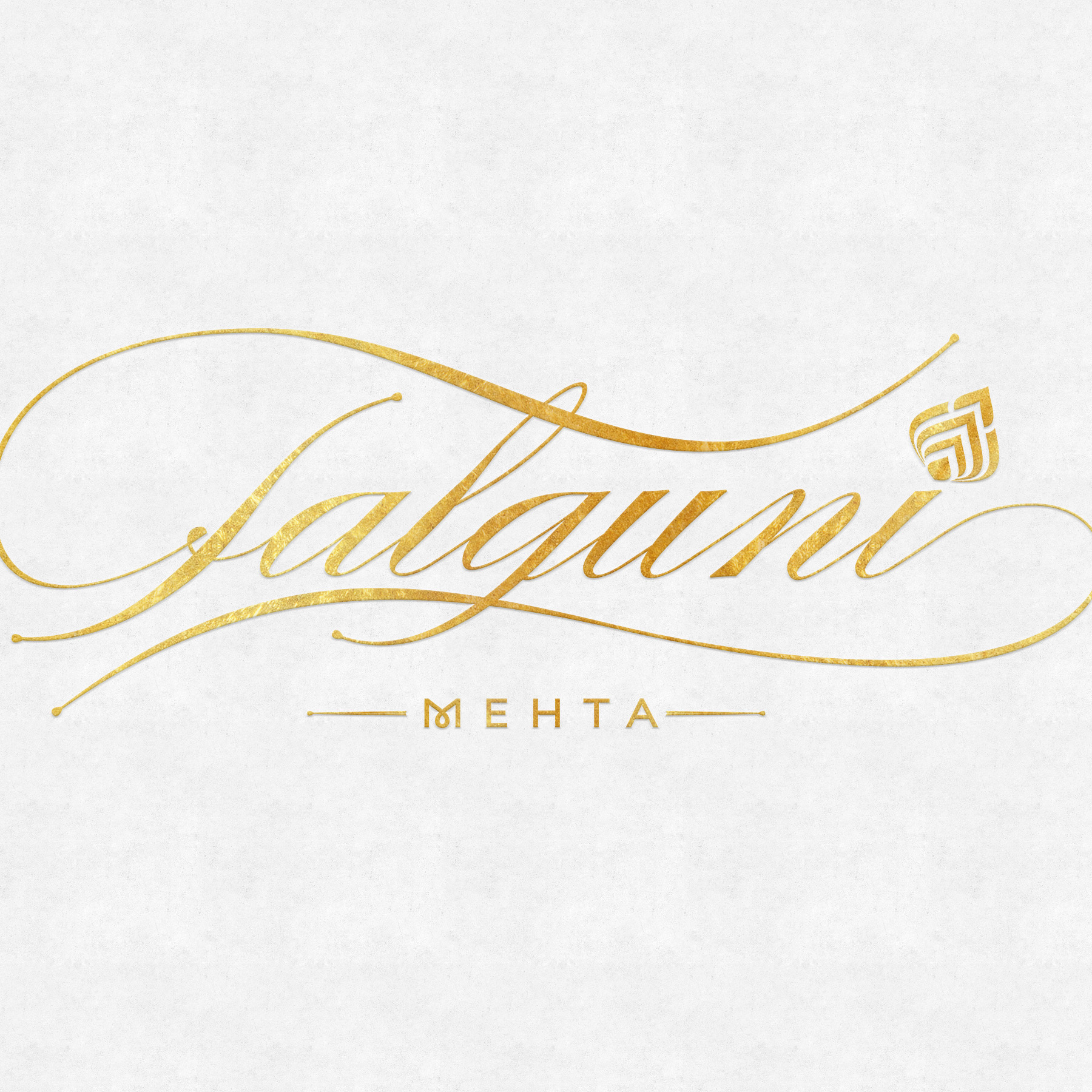
JEWELLERY BRAND | FALGUNI MEHTA | 2015
A clear brief is a gift. Calligraphic flourish, Jadau motif — the client knew exactly what she wanted. The work was in the making, not the deciding.

14
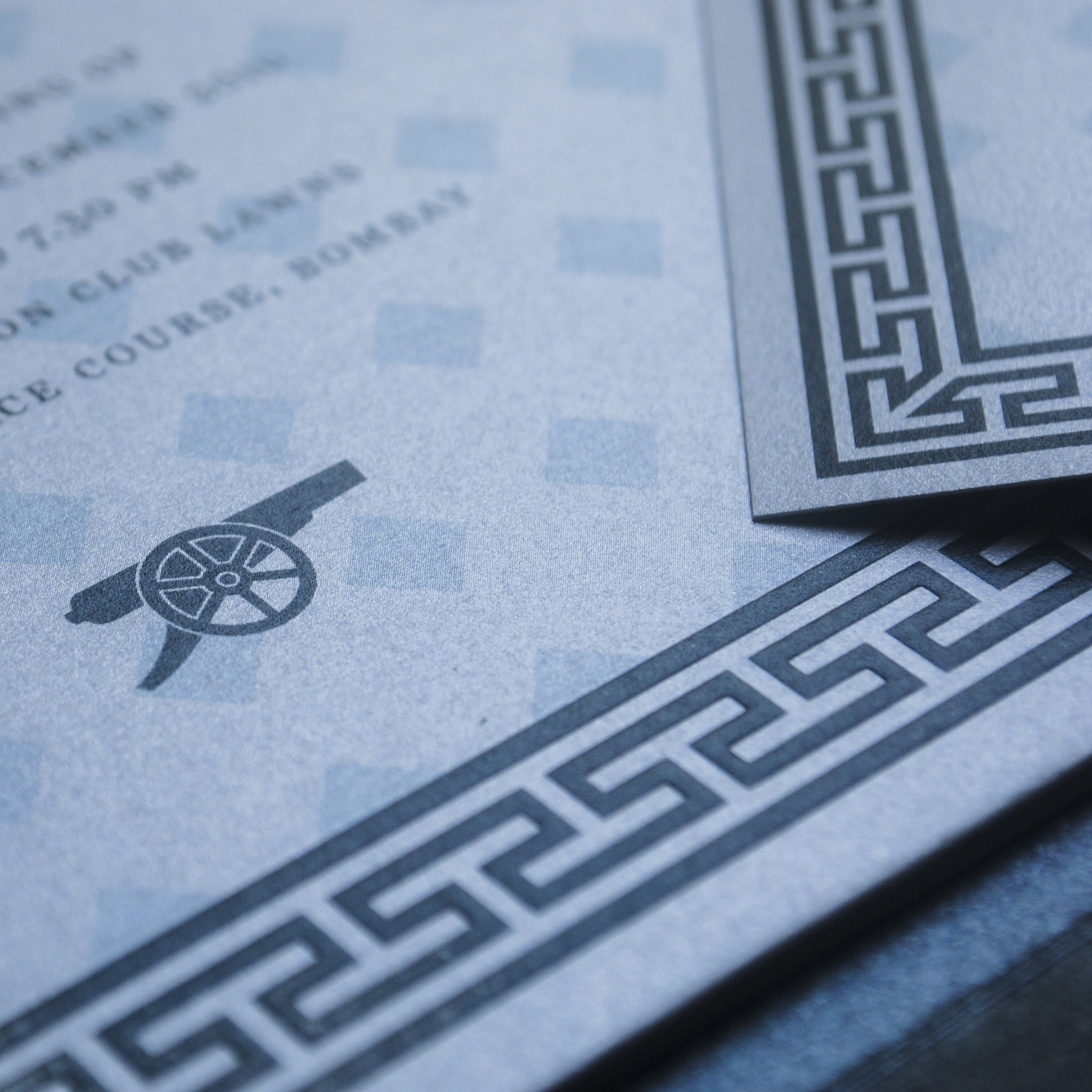
WEDDING INVITATION | SWATI & FRED | 2010
Two gooners. One religious symbol — an embossed cannon, fine and deliberate, on a thick square plaque that slid into a silver-grey jacket with a breath of blue. The most personal brief I ever had.

15
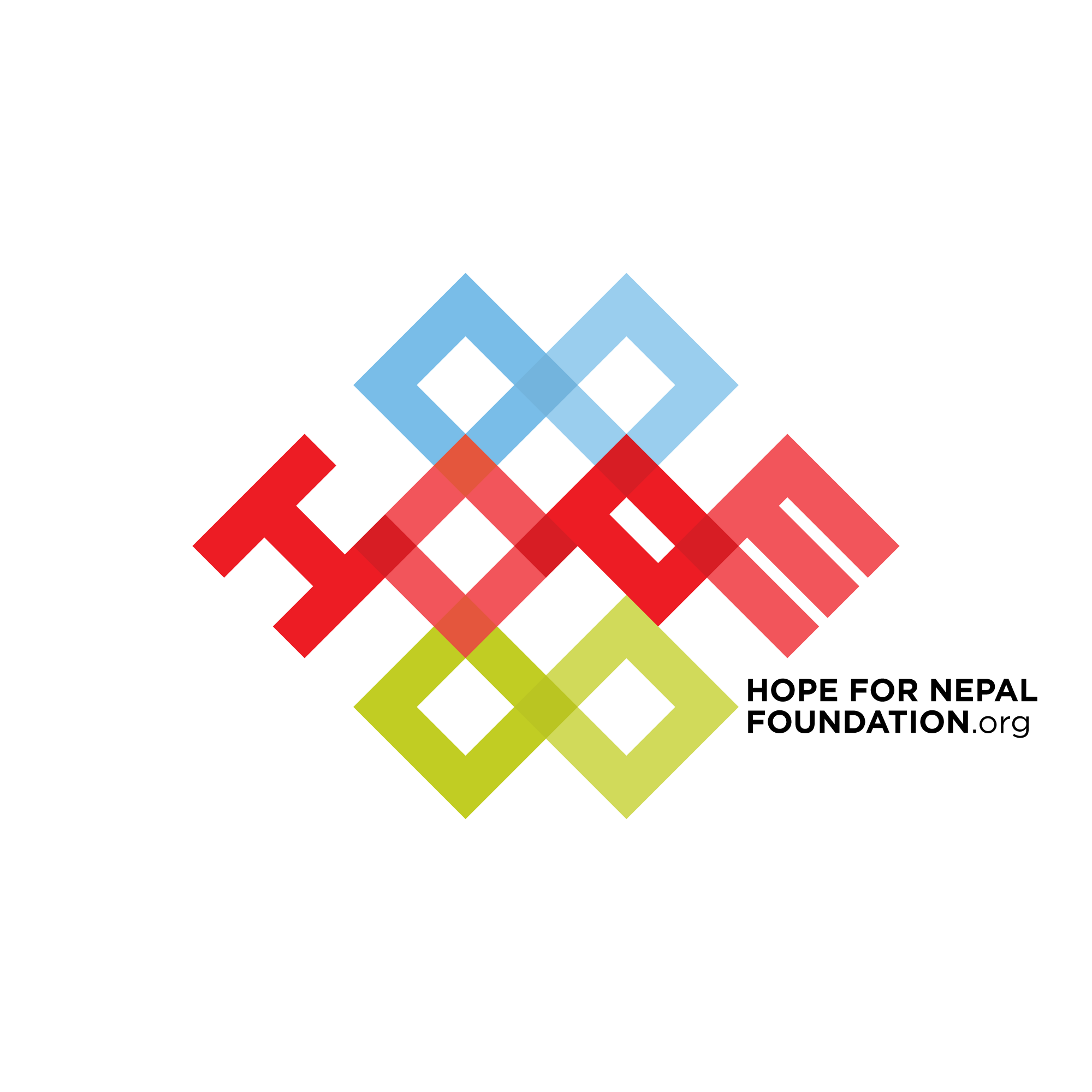
HOPE FOR NEPAL | EARTHQUAKE RELIEF | 2015
A logo for a charitable fund born from the rubble of the Gorkha earthquake. The Endless Knot — intertwined lines with no beginning and no end — carried the only appropriate message. Wisdom and compassion, unbroken.
Blue for the sky and the future it holds. Red for the fire of the Nepali people. Green for the earth and what grows from it again.

16
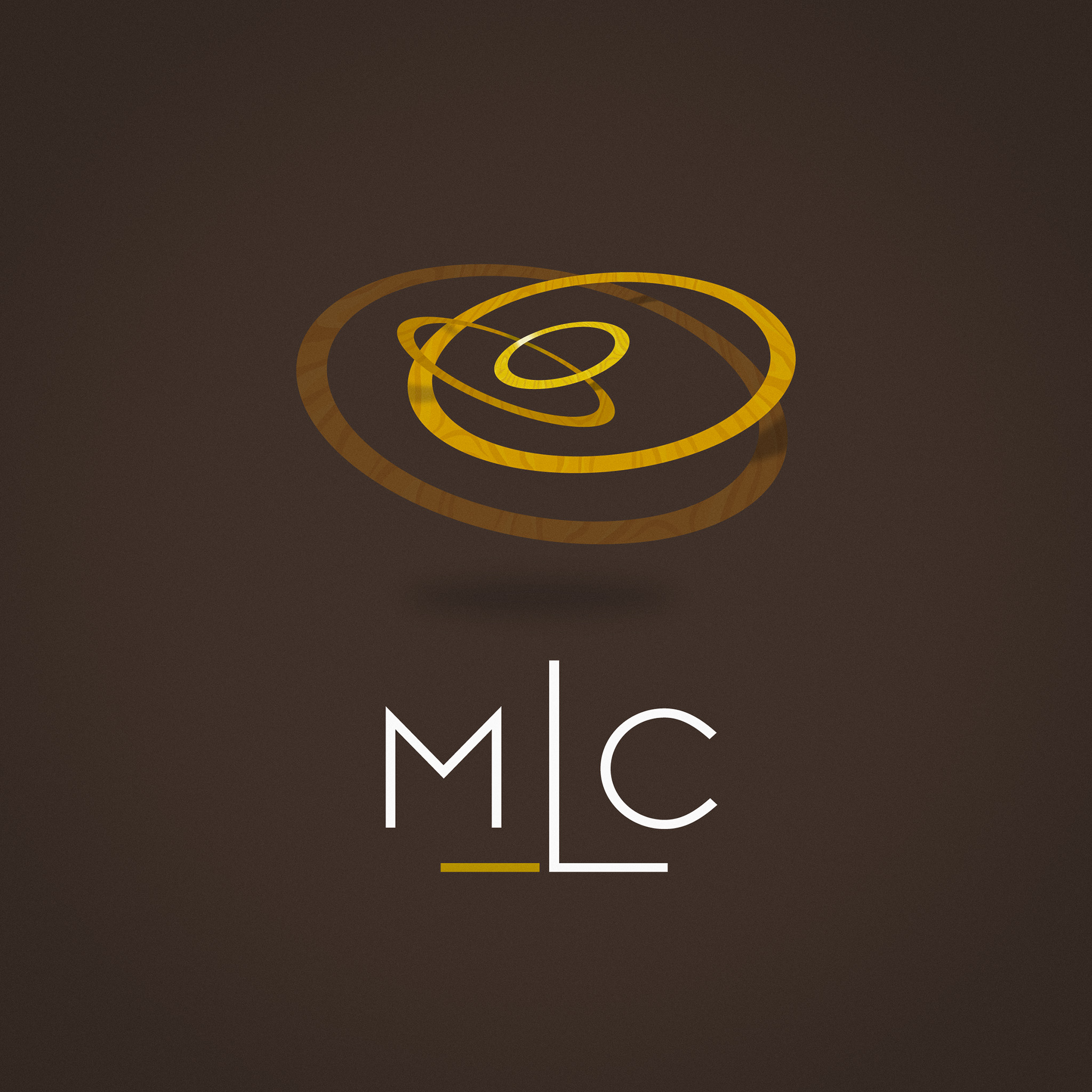
MULTILEVEL LEADERSHIP CONSULTING | LOGO | 2012
Executive coaching for CEOs and leaders who want to grow without losing themselves in the climb. The logo — concentric rings on different planes in 3D space — borrows from the cross-section of a tree trunk. Every ring a year. Every year, evidence.
01 / 16
CROWN VET | IDENTITY DESIGN | 2015
Pratapsinh Gaekwad comes from the royal house of Baroda. When he founded one of India's first premium veterinary care chains, the name Crown carried bloodline. The identity was built around something more personal — Chevy, his Great Dane, whose black fur patch over one eye was the single most distinctive thing about him. That patch and crown together became the face of the brand.
Aqua and deep red. Museo Slab. Stark, warm, and built to last.
Today Crown Vet has clinics across six cities and a partnership with Mars Veterinary Health. The logo was there from the beginning.
Go to link01
CROWN VET | IDENTITY DESIGN | 2015
Pratapsinh Gaekwad comes from the royal house of Baroda. When he founded one of India's first premium veterinary care chains, the name Crown carried bloodline. The identity was built around something more personal — Chevy, his Great Dane, whose black fur patch over one eye was the single most distinctive thing about him. That patch and crown together became the face of the brand.
Aqua and deep red. Museo Slab. Stark, warm, and built to last.
Today Crown Vet has clinics across six cities and a partnership with Mars Veterinary Health. The logo was there from the beginning.
02
JEWELS BY QUEENIE | LOGO DESIGN | 2005
Queenie Singh — former Miss India, jewellery designer, and one of Mumbai's most recognisable faces — launched her label in 2003 and grew it into a name worn from Bandra to Beverly Hills. A logo for a woman who needed no introduction. Trajan's long-tailed ‘Q’ understood the assignment.
03
SPANEOS | IT COMPANY BRANDING | 2014
Seven senior professionals who had each led software majors came together to build something new. Their brief was one word — transformation. The tangram, a puzzle of seven pieces that shifts and reforms into endless configurations, became the identity — seven founders, seven pieces, one idea.
04
BOOK COVER DESIGN | RISHAD MEHTA | 2015
Fast Cars and Fidgety Feet. Road- and walk-trips across the world, in extraordinary cars, written by a man who became a travel writer because a job ad was wrapped around his lunch one day. Cover design and section typography.
05
ART COLLECTOR LOGO | A. NAGAR | 2004
The barest logo for an art curator who championed Indian and African art before the world caught up. A rough, unfinished wooden frame — humble by design. Nagar was only ever the custodian. The art was always passing through.
06
ROYAL CREST | GAEKWADS OF BARODA | 2012
A 17th century crest — illustrated turban, sword, full colour — reduced to its absolute essence. Pratapsinh Gaekwad wanted something that carried the weight of dynasty without the costume. Long and hard work, quietly worn.
07
MEJCRA FOUNDATION | COMMUNITY | 2020
Mancherji Joshi envisioned and carved out a Parsi colony out of a marsh land. What stands in Dadar today — green, ordered, quietly magnificent — began with that one man who dared. This crest was made for the foundation that still carries his name and his work forward.
08
WINETAGE | LOGO | 2010
A Parisian Wine Investment Fund. Two chalices form a W. The wine level rises — steadily, deliberately, suggesting increasing returns. A crest for a fund that did exactly what it promised.
09
PERSONAL LOGO | TRAVEL WRITER | 2010
Rishad Mehta is a travel writer who arrives somewhere and doesn't leave until he's wrung it dry. One unbroken line — it knots and loops and coils into a city's worth of experience, then continues outward. The journey never stops.
10
AVA MARINE | YACHT DEALER | 2011
A Mumbai company that has lived on the water since 1989 — selling, managing and maintaining yachts for India's private sailing community. The logo needed to carry that quiet authority. Sea-level confidence. Nothing to prove.
11
NOUX | HEALTH-TECH PROVIDERS | 2020
One of my favourite pieces, it is the N-O-U-X that spells out the logo — look again, you'll nod. The whole is an eye and the little "x" subscript is reminiscent of the Rx of healthcare.
12
NEW SCHOOL | UNIVERSITY SOFTWARE | 2010
Patrick Malley wanted a logo that said his company did things differently. New School builds software for universities — and the name itself was the brief. A school of fish, all swimming one way. One going the other. That lone fish is the idea — the uncharted path, the unconventional thinker, the new school. Three readings, one mark.
13
JEWELLERY BRAND | FALGUNI MEHTA | 2015
A clear brief is a gift. Calligraphic flourish, Jadau motif — the client knew exactly what she wanted. The work was in the making, not the deciding.
14
WEDDING INVITATION | SWATI & FRED | 2010
Two gooners. One religious symbol — an embossed cannon, fine and deliberate, on a thick square plaque that slid into a silver-grey jacket with a breath of blue. The most personal brief I ever had.
15
HOPE FOR NEPAL | EARTHQUAKE RELIEF | 2015
A logo for a charitable fund born from the rubble of the Gorkha earthquake. The Endless Knot — intertwined lines with no beginning and no end — carried the only appropriate message. Wisdom and compassion, unbroken.
Blue for the sky and the future it holds. Red for the fire of the Nepali people. Green for the earth and what grows from it again.
16
MULTILEVEL LEADERSHIP CONSULTING | LOGO | 2012
Executive coaching for CEOs and leaders who want to grow without losing themselves in the climb. The logo — concentric rings on different planes in 3D space — borrows from the cross-section of a tree trunk. Every ring a year. Every year, evidence.

fredisdead
@gmail.com
Design. Strategy. Arsenal. Chocolate. Tea with mint leaves. Fonts. Sting. SAMBAS.
CONTACT
bottom of page